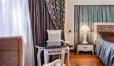
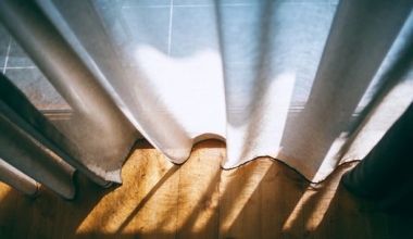
Choosing the right curtain fabric color can transform a room from ordinary to extraordinary. The color of your curtains influences mood, natural light, perceived room size, and even the effectiveness of functional fabrics like blackout, sheer, velvet, and acoustic curtains. This in-depth guide will walk you through everything you need to know about selecting the perfect curtain fabric colors for your space, from color psychology to practical testing tips.
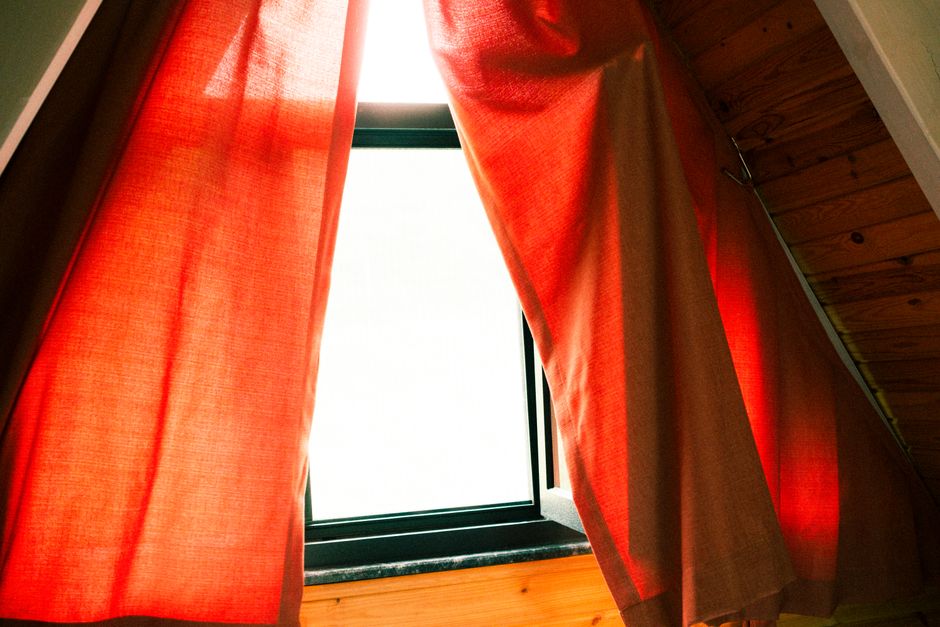
Understanding Color Psychology in Curtain Fabrics
Colors have a profound psychological impact on our emotions and behaviors. When it comes to curtain fabrics, the color you choose sets the tone for the entire room. Before selecting a shade, consider how you want the space to feel: energetic, calm, cozy, or professional.
Warm vs. Cool Colors
Warm colors (reds, oranges, yellows) evoke warmth, comfort, and sociability. They are ideal for living rooms and spaces where you entertain guests. However, warm tones can make a small room feel smaller and intensify the sense of heat. Cool colors (blues, greens, purples) promote relaxation and focus, making them perfect for bedrooms and home offices. Cool tones can visually expand a room and create a serene atmosphere.
Neutrals and Their Impact
Neutral colors—white, beige, gray, taupe, and greige—are timeless choices that offer versatility. White and off-white curtains make rooms feel airy and clean, but they require more frequent cleaning and offer less light blocking. Gray curtains add sophistication and work well in modern interiors, while beige and taupe create an organic, earthy feel. Neutrals are excellent because they allow other design elements to shine.
___PROTECTED_1___
Choosing Curtain Colors for Each Room
Different rooms serve different purposes, and your curtain color should reflect that. Here are tailored recommendations for common spaces.
Living Rooms
The living room is a hub for relaxation and social interaction. For a balanced ambiance, consider mid-tone neutrals like greige or warm gray. If you want to make a bold statement, deep terracotta or navy blue can add depth and sophistication. Sheer curtains in soft ivory or light linen create an open, breezy feel, while blackout or velvet curtains in rich jewel tones lend drama and luxury.
Bedrooms
In bedrooms, the priority is usually darkness and tranquility. Blackout curtains are essential, but color matters too. Soft blues, lavender, and sage green promote restfulness. If you prefer neutral bedrooms, warm charcoal and soft greige with a blackout lining offer both elegance and practicality. Avoid bright, stimulating colors like vivid orange or neon pink, as they can interfere with sleep.
Home Offices
For productivity, opt for colors that enhance focus but reduce glare. Light to medium greens and blues are ideal, as they are easy on the eyes and evoke clarity. Acoustic curtains in a muted tone, such as heather gray or soft olive, not only control sound but also create a professional backdrop for video calls. Sheer curtains in white or light beige can diffuse harsh sunlight, preventing monitor glare.
Kids' Rooms
Kids' rooms can handle playful colors, but it's wise to choose shades that can grow with the child. Pastel yellows, mint green, and powder blue are youthful yet adaptable. Blackout curtains in vibrant colors like coral or turquoise are fun and practical for nap times. Consider pairing a bright color with a neutral lining or using patterned acoustic panels to blend energy with functionality.
___PROTECTED_2___
Matching Colors with Curtain Fabric Types
The fabric type influences how color is perceived and how effective the curtains are. Here's how to pair color with each curtain category.
Blackout Curtains
Blackout curtains are designed to block light, and their color affects the degree of blocking. Darker colors naturally absorb more light, making deep shades like navy, chocolate brown, or burgundy excellent for optimum darkness. However, white or light-colored blackout curtains with a specialized lining can also achieve high light-blocking while reflecting heat. Consider the room's energy efficiency: dark curtains absorb heat, which is beneficial in cooler climates but can overheat a sunny room.
Sheer Curtains
Sheer curtains are all about diffusing light while maintaining privacy. Lighter colors like white, ivory, and pale pink enhance their airy quality, making rooms feel more spacious. If you want subtle color without sacrificing brightness, choose pastel sheers in aqua, blush, or butter yellow. Sheers in darker shades, like charcoal or deep blue, create a dramatic, moody effect but still allow filtered light through, adding an unexpected twist.
Velvet Curtains
Velvet is a luxurious, heavy fabric that looks stunning in rich saturated colors. Because of its texture, velvet absorbs light and adds depth to any hue. Jewel tones—emerald green, sapphire blue, amethyst purple—look especially majestic in velvet. For a more understated elegance, consider muted neutrals like dove gray, camel, or dusty rose. Velvet also has sound-absorbing properties, but it works best when paired with a thermal lining for blackout functionality.
Acoustic Curtains
Acoustic curtains are engineered to reduce noise pollution. They are typically thick and layered with mass-loaded vinyl or other sound-absorbing materials. Color-wise, acoustic curtains are available in a broad range, but the most effective acoustic colors are those with a matte finish, as they don't reflect sound waves. Earth tones, muted blues, and greys are popular choices for both performance and aesthetics. If you need acoustic curtains in a public space, like a restaurant or office, choose colors that complement your brand while blending with the interior.
The Effect of Natural and Artificial Light
Light dramatically changes how curtain colors look. A color that appears vibrant in the showroom may look completely different in your home due to natural light, room orientation, and bulb types.
- North-facing rooms: Receive cool, diffused light, making colors appear deeper and cooler. Choose warmer tones like peach, cream, or warm beige to balance.
- South-facing rooms: Get bright, warm light for most of the day. Cool colors like blue, green, and gray will help tone down the intensity.
- East-facing rooms: Have warm amber light in the morning and cooler light in the afternoon. Versatile neutrals work well here.
- West-facing rooms: Experience strong, warm afternoon sunlight. Light colors can prevent heat buildup, while medium tones reduce glare.
Additionally, artificial lighting affects your curtain colors. Incandescent bulbs cast a warm yellow glow, which intensifies reds and yellows. LED bulbs tend to be cooler and harsher, emphasizing blues and greens. Test your curtain fabric under both daylight and evening lighting to ensure the color works around the clock.
Color Combinations and Patterns
While solid-colored curtains are easy to use, combining colors or using patterns can elevate your design. Here are some tips for successful combinations:
- Contrast with walls: If your walls are neutral, choose curtains in a contrasting color to create a focal point. For example, white walls with charcoal velvet curtains.
- Tone-on-tone: Select curtains a few shades lighter or darker than your walls for a sophisticated, monochromatic look.
- Layer two fabrics: Combine sheer curtains in a light color with heavier blackout or velvet curtains in a darker shade for both flexibility and visual interest.
- Patterns: Geometric patterns add a modern edge; floral prints evoke a classic feel. When opting for patterns, ensure at least one of the pattern colors appears elsewhere in the room to unify the decor.
A helpful reference for pairing colors is the color wheel. Complementary colors (opposite each other) create high contrast and energy, while analogous colors (side by side) provide harmony and calm.
Practical Tips for Testing Curtain Colors
Never choose a curtain color based solely on a sample online. Fabric colors vary by dye lot and screen calibration. Here's how to test effectively:
- Order fabric swatches: Request physical swatches from your supplier. Hold them against your walls, flooring, and furniture.
- Pin them to the window: Drape the swatch over the curtain rod or pin it to the window area to see how light affects it.
- Assess at different times: Look at the color in the morning, afternoon, and evening.
- Use the blind test: Place a large, plain sheet or paper in the approximate color against the wall. This helps you judge the visual weight without distraction.
- Consider the fold: When curtains are drawn, they form folds that create shadows. A flat swatch looks different from a gathered fabric. Instruct your supplier to send a larger sample so you can simulate folds.
Frequently Asked Questions
What is the most popular curtain color?
White and off-white remain timeless favorites for their airy, neutral appeal. Gray is also highly popular in modern interiors because of its versatility.
Should I match curtain color to wall color or furniture?
There's no strict rule. Matching to walls creates a seamless look, while matching to furniture or accent pieces adds contrast. Consider the overall balance of the room.
Do dark curtains make a room smaller?
Dark curtains can make a room feel smaller and cozier, but they also add depth and drama. If you have a small room, opt for lighter fabrics with a subtle pattern to maintain a sense of space.
Can I use same color curtains in different rooms?
Yes, but consider the lighting and purpose. The same color may look different in each room, so test swatches in every space. You might also choose different fabric types for function.
Conclusion
Selecting the perfect curtain fabric color is a balance of psychology, functionality, and personal taste. By understanding how colors affect mood, how they interact with fabric types like blackout, sheer, velvet, and acoustic, and how light transforms them, you can make an informed choice that elevates your space. Always test swatches in your own environment, and don't be afraid to experiment with bold or layered options. With the right curtain color, you'll not only enhance your room's décor but also improve comfort and livability.