The Art of Curtain Color Combinations
Choosing the right curtain color combination can transform a room from ordinary to extraordinary. Curtains are one of the largest textile surfaces in any interior, and their color sets the tone for light, mood, and spatial perception. Whether you prefer airy sheer fabrics, light-blocking blackout panels, or plush velvet drapes, the color pairing is just as important as the fabric. This guide dives deep into practical, stylish, and functional curtain color combinations that work for every room and style.
___PROTECTED_1___
Understanding the Basics of Color Theory for Curtains
Before mixing and matching, it helps to revisit simple color theory. The color wheel is your best friend when pairing curtain colors with walls, furniture, and accent pieces.
- Complementary colors: Opposite on the wheel (e.g., blue and orange) create high contrast and energy.
- Analogous colors: Neighboring on the wheel (e.g., green and blue) offer a calm, cohesive harmony.
- Monochromatic schemes: Different shades and tints of the same hue provide a sophisticated, understated look.
- Neutral base: Whites, grays, and beiges anchor a room and allow bolder accents to shine.
For curtains, the best approach is to consider them as both a backdrop and an accent. If your walls are bold, use curtains in a neutral tone. If walls are plain, curtains can become the room’s focal point.
The Role of Undertones
Undertones are subtle hues that exist within a color. For instance, a gray curtain might have blue, green, or violet undertones. Always match or deliberately contrast undertones with your wall color and flooring. A quick trick: hold your curtain sample against the wall and step back. If it feels jarring, the undertone is likely clashing.
___PROTECTED_2___
Popular Curtain Color Combinations That Always Work
Based on decades of interior design practice, these pairings are foolproof for most homes:
1. White and Light Gray
This classic combo works in any room and with any fabric. White curtains with a subtle light gray stripe or pattern add depth without overwhelming the space. Use sheer white curtains for a breezy feel, or white-blackout panels for functionality. Light gray walls paired with white curtains create a bright, modern look.
2. Navy Blue and White
Navy is a deep, confident neutral that pairs beautifully with crisp white. White walls and navy curtains create a nautical-but-sophisticated vibe. Alternatively, use navy walls with white sheers to soften the dark surface. This combination is ideal for bedrooms and living rooms seeking a calm, classic atmosphere.
3. Earthy Tones: Beige, Terracotta, and Olive
For a grounded, organic feel, pair beige or greige walls with terracotta or olive curtains. These colors mimic nature and pair well with wooden furniture and indoor plants. These earthy combinations are warm and inviting, perfect for cozy living rooms or reading nooks.
4. Blush Pink and Charcoal
Blush pink curtains bring softness, while charcoal anchors the room. If the walls are charcoal, blush velvet curtains add a luxurious touch. If walls are light gray, charcoal curtains with a blush trim or pattern create balanced contrast. This combo is trendy and works in modern, feminine, or minimalist interiors.
5. Mustard Yellow and Teal
If you want an adventurous, energetic space, try mustard yellow curtains against teal walls or vice versa. These complementary colors are bold but balanced when one is muted. Use mustard in a low-pile fabric like cotton or linen to avoid visual heaviness. This pair shines in bohemian, eclectic, or mid-century modern interiors.
How to Match Curtain Colors to Wall and Floor Colors
The most common question is: “What curtain color goes with my walls?” Here’s a practical breakdown:
| Wall Color | Curtain Color Options | Effect |
|---|---|---|
| White / Off-white | Bold colors (navy, emerald, rust) or soft pastels | Adds depth and interest |
| Light Gray | White, darker gray, blush, mint | Keeps it airy or adds subtle contrast |
| Beige / Greige | White, cream, taupe, olive, brown | Creates a warm, cohesive look |
| Navy / Dark Blue | White, light gray, mustard, or sheer white | Brightens and softens the space |
| Green (Sage or Forest) | Cream, soft pink, brass-enhancing gold, or muted orange | Natural and balanced |
| Pink / Blush | White, gray, plum, or sage | Elegant and gentle |
When your floor is wood, consider its undertone. Warm wood floors (yellow or orange undertone) pair well with warm curtain colors (cream, terracotta). Cool wood floors (gray undertone) match better with cool curtain colors (blue, gray, white). If you want the curtains to stand out, choose a color that is three to four shades lighter or darker than the walls.
Using Patterns, Textures, and Layers in Curtain Combinations
Color doesn’t live in a vacuum. The fabric and pattern influence how the color is perceived. Here’s how to combine effectively:
Solid Color Curtains with Patterned Walls
If your wallpaper is bold or your furniture is patterned, choose solid curtains in a color pulled from that pattern. This anchors the room without fighting for attention.
Patterned Curtains with Neutral Walls
Geometric, floral, or stripe curtains in two or three colors can bring life to a neutral room. For curtains, a simple stripe that repeats the wall color is elegant. For example, white walls with blue-and-white striped sheers look fresh and timeless.
Double Curtain Rods with Layered Sheers and Blackouts
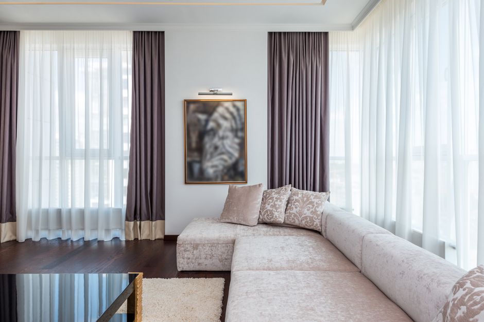
Layering is a brilliant way to combine colors without committing to one. Install a sheer panel (white or pale) in front and a colored blackout or velvet panel behind. During the day, the sheer gives you a light, soft look; at night, close the thicker curtain for fullness and privacy. This also offers environmental flexibility.
Room-by-Room Curtain Color Guide
Living Room Color Combinations
The living room is where you entertain and relax. Choose colors that reflect your lifestyle. For a serene space, use blue or gray curtains. For a lively room, consider warm orange or yellow. If you like switching decor often, neutral curtains paired with colorful throw pillows are ideal.
Bedroom Color Combinations for Better Sleep
Bedrooms benefit from darker, soothing colors. Blackout curtains in sage green, dusty blue, or soft lavender promote rest. Avoid bright red or neon, which can feel stimulating. Pair dark curtains with lighter sheers to balance the light and add a romantic layer.
Kitchen and Dining Area
Moisture and food odors are common, so choose easy-care fabrics like polyester or cotton. Light colors such as yellow, pale green, or white keep the kitchen fresh. For dining rooms, deeper jewel tones like aubergine or teal add sophistication, but make sure the curtains don’t block natural light during meals.
Home Office and Study
Productivity and focus are key. Green and blue enhance concentration. A combination of navy curtains with white walls is a classic executive look. If you use a video conferencing app, ensure that your curtain color doesn’t clash with your skin tone; avoid extremely bright colors that can cast colored light.
Pro Tips for Harmonious Curtain Color Combinations
- Test swatches in real light: Colors look different under morning, afternoon, and artificial light. Order samples and hang them for a few days.
- Follow the 60-30-10 rule: 60% of the room is the wall/floor/curtains (dominant color), 30% is furniture/textiles (secondary), and 10% is accent decor. Your curtains can occupy part of the 60% or 30%.
- Consider the room size: Light colors make a small room feel bigger and open. Dark colors can make a large room feel intimate and cozy. If a room is narrow, use horizontal stripes on curtains to visually widen it.
- Ceiling height illusion: Hanging curtains from the ceiling (with longer panels) in a lighter color than the walls can make a room feel taller. Use a dark color near the top to lower a very high ceiling.
- Don’t ignore hardware: The curtain rod and finials add an accent color. Black, brass, or matte silver can unify your color scheme.
- Use color to fix flaws: For example, if your room faces north (cold light), use warm-toned curtains (cream, peach, warm beige) to balance the coolness.
Common Mistakes to Avoid in Curtain Color Pairing
Here are pitfalls you might want to steer clear of:
- Going too close to the wall color without depth – the curtains can look drab or blend into the wall. If you love the same hue, pick a shade 2-3 tones lighter or darker.
- Ignoring the room’s existing color temperature – mixing warm and cool colors haphazardly creates visual chaos. Decide your dominant temperature and stick with it for large surfaces.
- Forgetting practical light control – a dark curtain will block more light, but if you need daylight, choose a lighter fabric or a double-rod setup.
- Using too many patterns – if your rug, sofa, and wall art are patterned, choose solid curtains with minimal texture.
- Not considering maintenance – white curtains can be stunning but may need frequent washing. Choose washability and stain-resistant fabrics for kids’ rooms or kitchens.
Curtain Color Combinations for Different Fabric Types
Fabric changes the color’s personality:
- Sheer curtains: Sheers diffuse light, making colors appear softer. Pastels and whites are popular, but bold colors in sheers create a striking stained-glass effect.
- Velvet curtains: Velvet absorbs light and intensifies color. Deep emerald, burgundy, and mustard look luxurious. Avoid light, pale colors in velvet unless the room is very well-lit.
- Blackout curtains: These have a dense weave or coating. Glossy blackout fabric reflects some light; a matte finish has a muted look. Blackout curtains work in dark, rich colors for bedrooms and media rooms.
- Acoustic curtains: Often made from heavyweight fabrics, acoustic curtains add visual weight. Their colors tend to be subdued, but layering with bright sheers can add vibrancy while retaining sound absorption.
Final Thoughts: Follow Your Eye and Your Lifestyle
Curtain color combinations are a blend of design rules and personal expression. Trust your instincts once you understand the basics. Let the room’s function, your furniture, and the desired mood guide your choices. Whether you go bold with contrasting hues or subtle with tonal elegance, the right curtains will frame your windows and elevate your entire interior.
Before you buy, always order fabric samples and view them in your room’s lighting at different times of day. That little extra effort saves time, money, and disappointment. Happy decorating!