1. Consider the Room's Purpose
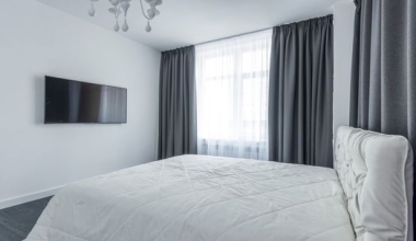
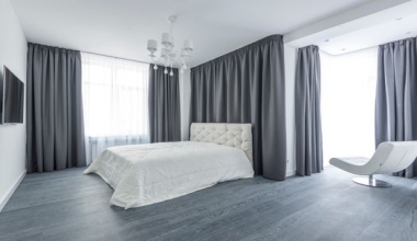
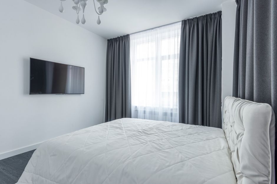
The function of the room is the most critical factor when selecting blackout fabric colors. A bedroom designed for sleep benefits from deep, dark shades like charcoal, navy, or espresso, which absorb light and create a cocoon-like environment. These hues minimize any light leakage and promote melatonin production, making them ideal for shift workers or light-sensitive sleepers.
For a home theater or media room, consider a true black or very dark gray to eliminate reflections on screens. Conversely, a nursery might use a soft blackout fabric in pastel tones—still effective at blocking light but visually gentler. If the room serves multiple purposes, such as a living room that also functions as a guest space, opt for versatile neutrals that balance light control with daytime ambiance.

2. Dark Colors for Maximum Light Blocking
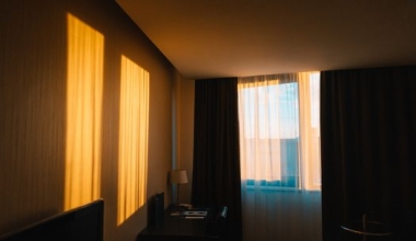
When maximum light suppression is your priority, dark colors perform best. Black, midnight blue, and deep burgundy absorb more incoming light than lighter shades, reducing even the faintest glows from streetlights or early morning sun. The fabric's thread count and weave also matter, but color plays a major role: a blackout fabric in a dark shade can block up to 99% of light, whereas a white or cream version might allow a small percentage through.
Keep in mind that dark blackout curtains can make a small room feel smaller or heavier. If that concerns you, pair them with light-colored walls and bright accessories to maintain an open feel. Alternatively, use dark curtains only on the side facing the window and a decorative lighter layer on the room side.

3. Light Colors for Heat Reflection
In sun-drenched climates, light-colored blackout fabrics offer a thermal advantage. White, cream, and pale gray reflect solar radiation rather than absorbing it, helping to keep interior temperatures cooler. This white backing is common in many blackout curtains—it's often the coating that blocks light while the visible side is a different color. But if the entire fabric is light, you gain both light blocking and heat rejection.
Use light blackout curtains in south- and west-facing windows where heat gain is highest. They also reduce UV damage to floors and furniture without darkening the room excessively during the day. For a compromise, choose two-tone blackout curtains: a light exterior side that faces the sun and a darker interior side for the room.
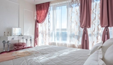
4. Match Your Interior Design Theme
Blackout curtains no longer mean sacrificing style. Today's fabrics come in a vast array of colors and textures, from sleek metallics to matte naturals. Choose a shade that complements your existing palette—for instance, a soft sage green for a Scandinavian look, or a warm terracotta for bohemian interiors. The color should flow with wall paint, furniture, and accent pieces.
Don't overlook pattern: blackout fabrics also come in stripes, geometric prints, and florals. A patterned blackout curtain can serve as the room's focal point while still delivering exceptional light control. Just ensure the pattern's colors include a dark base to preserve blackout efficiency. When in doubt, neutral tones like taupe, greige, or charcoal blend with almost any decor.
5. Think About Fading and Sunlight Exposure
All blackout fabrics protect furnishings from UV rays, but the curtain's own color can fade over time if exposed to constant direct sun. Darker shades, especially reds and purples, are more prone to pigment breakdown. For windows with extreme sun exposure, choose solution-dyed or fade-resistant materials like polyester blends, which hold color better.
Lighter colors inherently show less fading, but they can yellow if the blackout coating degrades from heat. Look for fabrics with a UV-stabilized coating and a high colorfastness rating. Rotating curtains between seasons can also prolong color life. If fading occurs, consider a reversible design or one with a sacrificial outer layer.
6. Test Samples in Different Lighting Conditions
Never commit to a color based on a swatch in a store. Blackout fabrics can look completely different under natural daylight, incandescent bulbs, and at night. Request multiple samples and tape them to your window to observe how the same shade appears at 8 a.m., noon, and evening. What looks like a warm beige in the showroom might appear grayish in your room's specific light.
Also assess how the color interacts with your wall color and floor. A dark navy might clash with warm wood tones, while a cool charcoal could enhance them. Use the samples to see translucency—some lighter blackout fabrics may not be fully opaque on the edges. Hold them up to a lamp to check for pinhole light leaks.
7. Don't Forget the Backing and Lining Colors
Blackout curtains often have a coated backing or a separate lining. Standard blackout linings are white, gray, or beige. A white lining reflects heat but can make the curtain appear lighter from the back, which matters if the curtain is visible from outside. For a uniform exterior look, choose a lining color that matches the front hue or opt for a neutral that complements your home's facade.
Some premium blackout fabrics have a black or charcoal lining on the window side to absorb any residual light before it passes through. This is ideal for media rooms or nurseries where total darkness is essential. Check if the lining adds bulk to the fabric and affects how the curtain drapes. Always verify the lining's care instructions—some require dry cleaning while the front can be machine washed.
| Color | Light Blocking | Heat Reflection | Best For |
|---|---|---|---|
| Black/Dark Navy | Excellent (99%+) | Low | Bedrooms, Media rooms |
| White/Cream | Good (95-98%) | High | Sunny rooms, small spaces |
| Gray (Mid-to-Dark) | Very Good | Moderate | Versatile, modern decor |
| Pastels | Good with blackout coating | Moderate | Nurseries, coastal themes |
Choosing the right blackout fabric color balances light control, heat efficiency, and aesthetic harmony. Test samples, consider the room's orientation, and match the shade to your lifestyle. With these seven tips, you'll find a color that makes your space both darker and brighter in all the right ways.