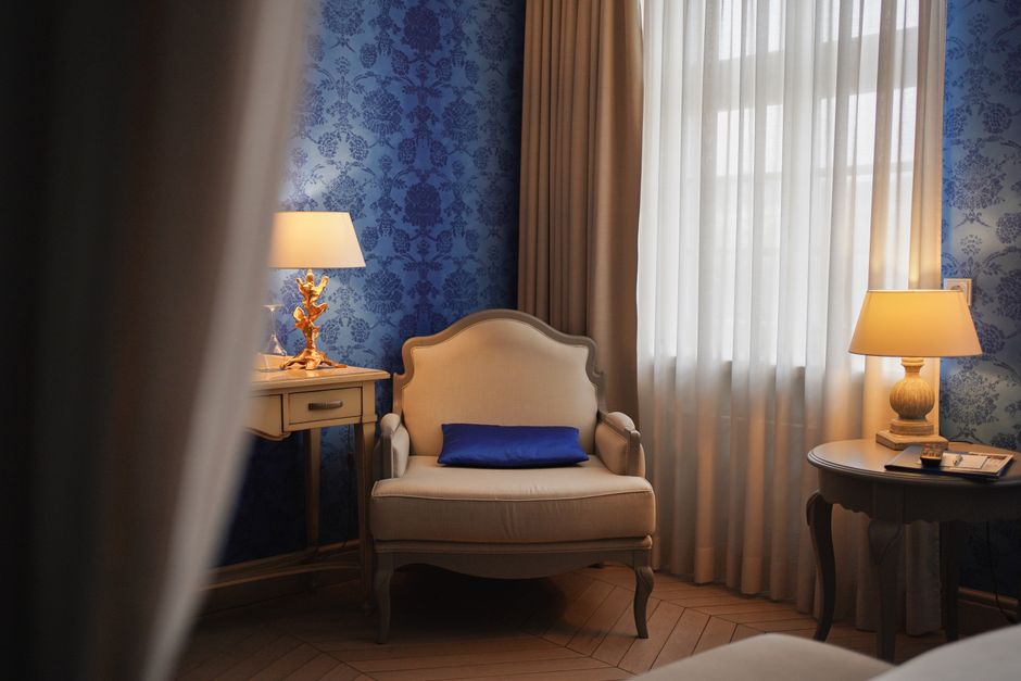
1. Embrace Blue Hues for Deep Calm
Blue is universally recognized as a calming color, making it a top choice for hotel guest rooms aiming to promote relaxation. Studies show that blue lowers heart rate and blood pressure, helping guests unwind after a long day of travel or business. For maximum effect, opt for medium to dark shades such as navy or slate, which anchor the room and create a cocoon-like atmosphere. Pair these with blackout curtain linings to block out light completely, ensuring uninterrupted sleep.
Velvet curtains in deep blue add a touch of luxury while enhancing the color's soothing properties. The plush texture absorbs sound, contributing to a quieter environment. For rooms with limited natural light, sheer blue curtains can soften incoming light without overwhelming the space. Remember to consider the room's orientation: north-facing rooms benefit from warmer blue tones with a hint of green to avoid feeling cold.
2. Choose Green Tones for Balance and Renewal
Green evokes nature, balance, and renewal, making it ideal for guest relaxation. It reduces anxiety and creates a sense of harmony. Soft sage or muted olive green curtains work well in hotel settings, especially when combined with natural materials like wood and linen. These shades are versatile and complement a wide range of interior styles, from modern minimalist to rustic charm.
For acoustic benefits, layered curtains with a green velvet front and a blackout backing can dampen noise from hallways or streets. This combination not only controls color psychology but also improves sleep quality. Sheer green curtains allow diffused light, creating a fresh, airy feel during the day. To maintain the color's calming effect, avoid overly bright or neon greens, which can be stimulating.
3. Incorporate Lavender for Tranquility and Luxury
Lavender, a soft purple with blue undertones, is associated with tranquility and luxury. It's particularly effective in hotel rooms designed for spa-like experiences. Lavender curtains can promote drowsiness and reduce stress, making them a smart choice for bedrooms. The color works beautifully in both velvet and sheer fabric options, depending on the desired ambiance.
When using lavender, balance it with neutral tones like cream or gray to prevent the room from feeling overly feminine or cool. Acoustic curtains in lavender help minimize noise, enhancing the serene environment. For a sophisticated look, pair lavender blackout curtains with metallic hardware. Remember that lighter shades like lilac are more relaxing than deeper purples, which can feel heavy.
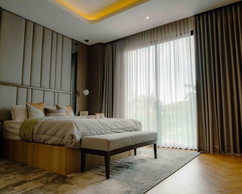
4. Opt for Warm Neutrals to Create a Cozy Sanctuary
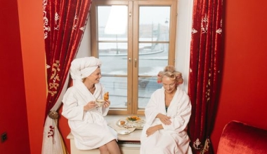
Warm neutral tones such as beige, taupe, and soft gray are timeless choices for hotel guest rooms. They evoke feelings of comfort, safety, and warmth without being distracting. These colors are particularly effective in rooms with large windows, as they help soften harsh light. Velvet curtains in warm neutrals add texture and a sense of opulence.
From a practical standpoint, neutral curtains are easy to maintain and blend with any decor. Blackout linings ensure darkness for sleeping, while the neutral color keeps the room from feeling cave-like. For added depth, consider herringbone or subtle patterns in the same color family. Acoustic curtains in these shades absorb sound efficiently, contributing to a quiet retreat.
5. Use Soft Pink to Foster Care and Compassion
Soft pink is a nurturing color that can make guests feel cared for and comforted. It's especially suitable for boutique hotels or rooms aimed at solo travelers seeking relaxation. Blush pink curtains in sheer fabric allow gentle light to filter through, creating a dreamy atmosphere. For more privacy and light control, opt for blackout pink curtains with a matte finish.
Pink pairs well with gray, white, or natural wood. Avoid intense pinks like fuchsia, which can be overstimulating. In a hotel context, soft pink curtains can be used in combination with warm lighting to enhance the relaxing effect. Velvet pink curtains add a tactile element that invites touch, further promoting ease.
6. Select Earthy Browns and Terracotta for Grounding
Earthy tones like brown, terracotta, and rust connect guests to the ground, providing a sense of stability and comfort. These colors are increasingly popular in hotel design for their organic feel. Terracotta curtains in a matte blackout fabric can create a warm, inviting glow when backlit by the sun.
Acoustic curtains in these shades help absorb sound, making the room quieter. To avoid a dark or heavy look, pair brown curtains with lighter walls and furnishings. Velvet or linen blends work well for texture. These colors also hide dust and stains better than lighter shades, making them practical for high-turnover hotels.
7. Consider Blue-Green (Teal) for a Fresh Retreat
Teal combines the calm of blue with the renewal of green, creating a unique color that feels both refreshing and relaxing. It's a sophisticated choice for hotel rooms aiming for a modern, tranquil vibe. Teal curtains in blackout fabric ensure complete darkness, while the color itself evokes images of serene waters and clear skies.
Use teal in rooms with good natural light to prevent it from feeling too dark. Pair with white or cream bedding for contrast. Velvet teal curtains add a rich, luxurious touch that guests associate with high-end accommodations. For acoustics, layering teal sheers with a blackout liner provides flexibility for light control and noise reduction.