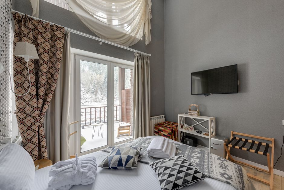
Introduction
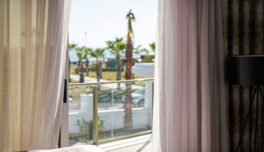
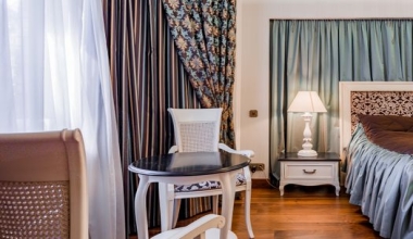
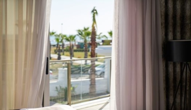
The color of hotel curtains is far more than a decorative afterthought—it is a strategic tool that influences guest perception, comfort, and even booking decisions. From the moment a guest walks into a hotel room, the curtain color sets the tone for their entire stay. Whether it's a luxurious velvet drape in a five-star suite or a sheer blackout curtain in a budget-friendly chain, the right hue can transform a room from ordinary to unforgettable. This comprehensive guide delves into the art and science of hotel curtain color selection, covering psychology, functionality, and practical tips to help designers and hoteliers make informed choices that enhance brand identity and guest satisfaction.
___PROTECTED_1___
Understanding the Role of Curtain Colors in Hotel Ambiance
Curtains are one of the largest color blocks in a hotel room, often covering entire walls. Their color significantly impacts the perceived size, warmth, and mood of the space. For instance, light-colored curtains can make a small room feel airy and spacious, while dark hues add intimacy and coziness. Beyond aesthetics, curtain colors also affect how guests perceive cleanliness, luxury, and modernity. A well-chosen color scheme can reinforce a hotel's brand—think soothing earth tones for a spa retreat or bold jewel tones for a boutique hotel. Additionally, curtain colors interact with natural light throughout the day, creating dynamic shifts in ambiance. Understanding these effects is the first step toward a successful selection process.
___PROTECTED_2___
Key Factors Influencing Curtain Color Selection
Brand Identity and Theme
Every hotel has a personality, and its curtains should reflect that. A beach resort might opt for crisp white or soft aqua to evoke ocean breezes, while an urban business hotel may prefer charcoal or navy for a sleek, professional look. Consistency across all rooms is crucial for strong branding, but some hotels use varied colors in different room tiers to signal exclusivity (e.g., premium suites with deep burgundy).
Room Size and Lighting
Small rooms benefit from light, neutral tones that bounce light and create an illusion of space. Conversely, large rooms can handle darker shades that add depth and drama. Consider the amount of natural light: north-facing rooms often appear cooler, so warm colors can balance them, while south-facing rooms may need cool tones to prevent overheating visually.
Functional Requirements
Curtain fabrics serve dual purposes: blackout, sheer, velvet, or acoustic. The color choice must align with the fabric's function. For blackout curtains, lighter colors are possible with modern linings, but dark colors are more common for effective light blocking. Velvet drapes in rich colors like emerald or sapphire exude luxury but require careful cleaning. Sheer curtains often come in whites or pastels to filter light softly. Acoustic curtains, which dampen sound, are available in many colors, but lighter shades may show dirt more easily.
Popular Color Palettes for Hotels
| Color Palette | Mood/Ambiance | Suitable Hotel Types |
|---|---|---|
| Warm Neutrals (beige, taupe, cream) | Cozy, timeless, versatile | Boutique inns, vacation rentals, luxury resorts |
| Cool Neutrals (gray, silver, white) | Modern, clean, spacious | Business hotels, urban hotels, minimalistic design |
| Earthy Tones (olive, rust, brown) | Grounding, natural, relaxing | Spa resorts, eco-hotels, mountain lodges |
| Bold Jewel Tones (emerald, sapphire, amethyst) | Luxurious, dramatic, memorable | Five-star hotels, themed suites, historic properties |
| Soft Pastels (blush, lavender, mint) | Gentle, romantic, calming | Beach resorts, wellness retreats, boutique hotels |
| Dark Darks (charcoal, navy, black) | Sophisticated, intimate, sleep-friendly | Casino hotels, nightlife venues, upscale urban stays |
Color Psychology for Guest Experience
Colors evoke emotional responses that can enhance or detract from a guest's stay. Blue tones promote calmness and trust, making them ideal for bedrooms. Green hues reduce anxiety and connect to nature, perfect for eco-friendly hotels. Red and orange stimulate energy—use in active spaces like gyms, not sleep areas. Yellow brings cheerfulness but may be too stimulating for rest. Neutral shades like gray and beige offer safety but can feel dull without accent colors. Purple suggests royalty and luxury, suitable for premium suites. Always consider cultural contexts: white symbolizes purity in some cultures, but mourning in others. Test color combinations with real fabric samples under different lighting conditions to ensure the desired effect.
Practical Tips for Choosing Hotel Curtain Colors
- Sample under actual lighting: Incandescent, LED, and daylight change color perception. Bring samples to the hotel room and view at different times.
- Consider maintenance: Lighter colors show stains and fading more easily; dark colors hide dirt but may show dust. For high-turnover rooms, choose easy-care fabrics with stain-resistant treatments.
- Match with wall and floor colors: Curtains should complement the existing palette. A common rule: curtains can be a shade darker or lighter than walls for harmony, or a contrasting color for accent.
- Think about blackout backing: If blackout is required, the color of the backing matters for heat reflection. Light-colored backings can reduce heat absorption in sunny climates.
- Acoustic performance: Heavier fabrics like velvet in dark colors absorb more sound, but color has minimal direct effect on acoustics. Focus on fabric weight and layers.
- Plan for seasonal adjustments: For year-round versatility, choose a color that works in all seasons. If the hotel has distinct seasonal decor, consider interchangeable curtain layers.
Case Studies: Successful Hotel Curtain Color Schemes
The Ritz-Carlton, Tokyo
Neutral beige curtains with subtle gold sheen complement the hotel's classic luxury. The soft color allows the stunning city views to take center stage while maintaining an elegant backdrop.
ACE Hotel, London
Bold navy blackout curtains in guest rooms create a cocooning effect, offset by light wood furniture and vibrant local art. The dark hue enhances sleep quality and adds a modern edge.
1 Hotel South Beach, Miami
Earthy olive-green velvet curtains reinforce the brand's eco-luxury ethos. The natural tone blends with the building's organic textures and softens the intense Miami sunlight.
Yotel Boston
Taupe sheer and blackout dual curtains provide flexibility: sheers filter light for a laid-back lobby feel, while darker panels ensure privacy and darkness at night. The neutral color works with the tech-forward, minimalist design.
Conclusion
Selecting the right curtain color for a hotel is a multifaceted decision that balances aesthetics, functionality, and brand story. By understanding the psychological impact of colors, considering the specific needs of each space, and testing thoroughly, hoteliers can create environments that delight guests and stand out in a competitive market. Whether you choose timeless neutrals or bold statements, the curtain color is a silent ambassador for your hotel's quality and attention to detail. Invest time, consult with professional designers, and always put the guest experience first—your curtain choice will speak volumes.